Revamping the vehicle detail page
Enhancing user satisfaction and addressing key challenges on our most used page
Enhancing user satisfaction and addressing key challenges on our most used page
Motoinsight faced challenges with platform effectiveness and perception, primarily due to being perceived solely as a lead generation tool, leading to complaints and customer attrition.
Our platform's digital retailing patterns were outdated and unconventional, with certain UI elements remaining unchanged for years. Its original design, meant for in-store use with sales staff, made it less user-friendly for online self-service.
Additionally, the user experience lacked coherence as it tried to accommodate various shopping scenarios, leaving car buyers uncertain about the next steps or where to find necessary information, ultimately impacting conversions.
These challenges made it clear that the platform needed a comprehensive revamp to meet its objectives and improve user satisfaction.
How might we create an enhanced platform that offers car buyers an intuitive self-serve experience with relevant information, transparent pricing, and a stress-free car buying journey, while also optimizing lead capture points for dealers to generate high-quality leads?
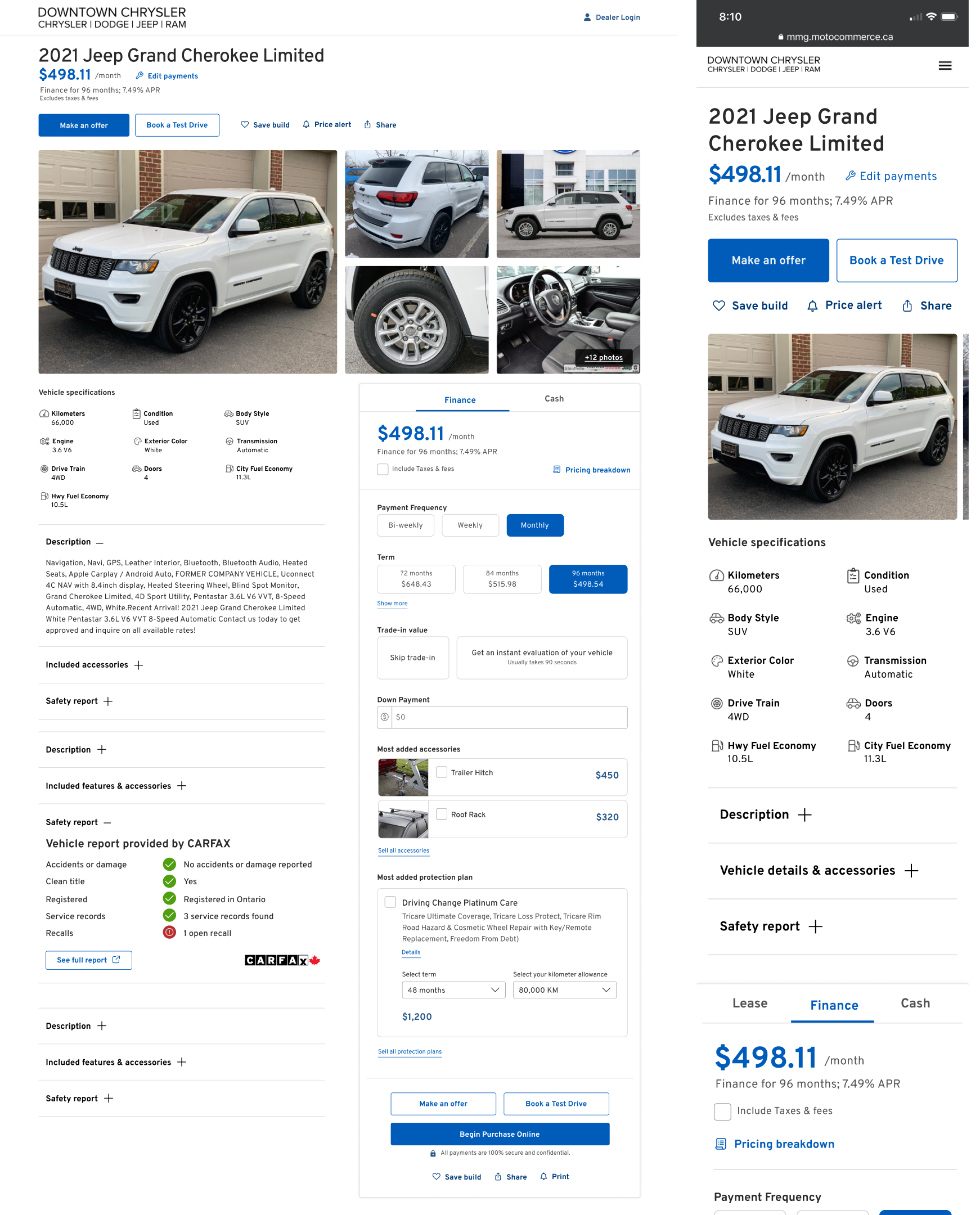
The page is cluttered with excessive information: images, vehicle details, pricing, transactional steps, and disclaimers.
Imagery is crucial for online shopping. The image carousel lacks innovation and advanced features, limiting user engagement. Without full-screen, zoom, or interactivity, users can't examine vehicle details closely, affecting their confidence in making purchase decisions.
Detailed pricing dominates the page, pushing vital transactional steps below the fold, causinguser frustration, especially on mobile devices.
The vehicle detailed page (VDP) serves multiple purposes, including New, Used, Virtual inventory, quoting, and checkout. However, with numerous calls to action and a one-size-fits-all approach, the page falls short in effectively addressing individual users' needs.
Our platform's design appears dated compared to competitors, impacting our ability to attract and retain users who expect modern, sleek interfaces.
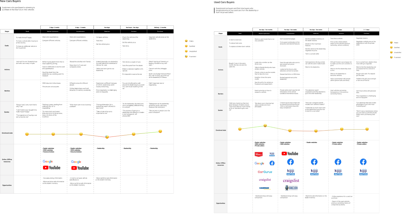
To kickstart the discovery phase, I conducted a comprehensive set of 27 in-depth interviews with in-market car buyers, featuring a total of 36 thought-provoking questions. These interviews served as a powerful tool to unearth valuable insights into their vehicle shopping journeys, specific usage needs, search and shopping behaviors, dealership interactions, and their perceptions regarding potential online shopping opportunities.

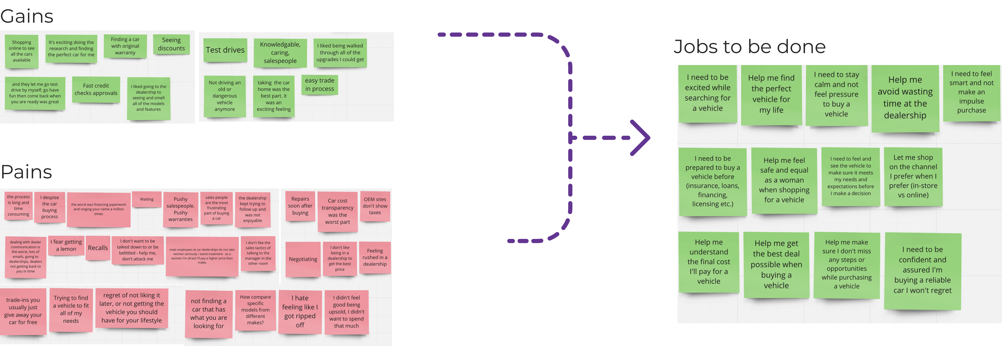
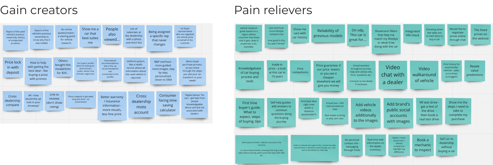
After a thorough review of all the data, both myself and the UX team synthesized it into a value proposition format, emphasizing the pains and gains our customers were experiencing. This process enabled us to break down these insights into 11 distinct "jobs to be done," giving us a comprehensive understanding of the needs of car buyers using our platform.
In order to have a thorough understanding of the entire car buyer journey and the information they might have encountered before reaching our page, I visualized the complete user journey for both new and used car buyers. This allowed me to streamline the content and focus on the most relevant information, eliminating any redundancy or unnecessary details that car buyers might have already come across during their research phase.
Intuitive Online Journey
Omnichannel Shopping Tools
Easy & convenient to use
Be in the driving seat
Confident & delightful online shopping experience
Ability to finalize the car shopping online
Increase customer engagement and conversion
Become more efficient
Become more profitable
Quality leads
Best foot forward (i.e. good visuals, pricing)
Ability to better merchandise their inventory
Increase Ratio of traffic to account creation
Increase Views
Decrease Bounce rate
Increase Test drives booked
Increase Trade appraisals
Increase Appointments booked
Increase Saved vehicles
Increase overall account creation
After presenting all the data across the company, I facilitated a collaborative workshop where we brainstormed ideas, features, and customer experiences to address the highlighted pain points.
With a thorough review of the data, requirements, and ideas, I was prepared to start wireframing. Beyond incorporating the most relevant features aligned with research findings, I sought to understand the ideal experience that would boost conversion and engagement for car buyers at this stage of their shopping journey.
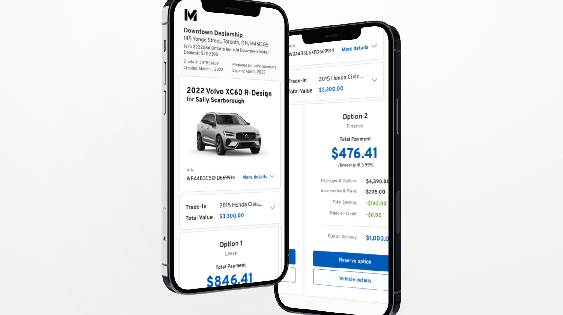
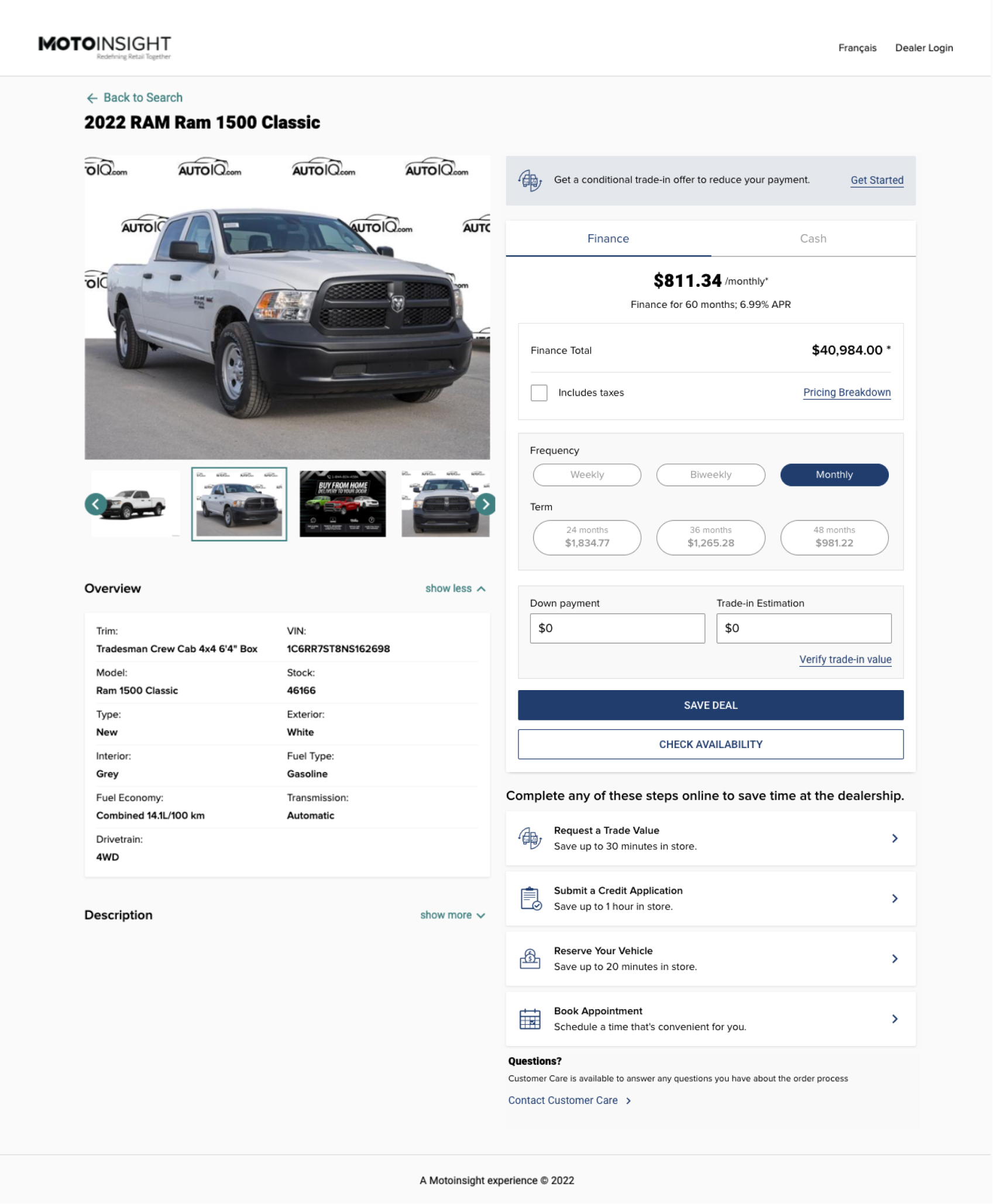
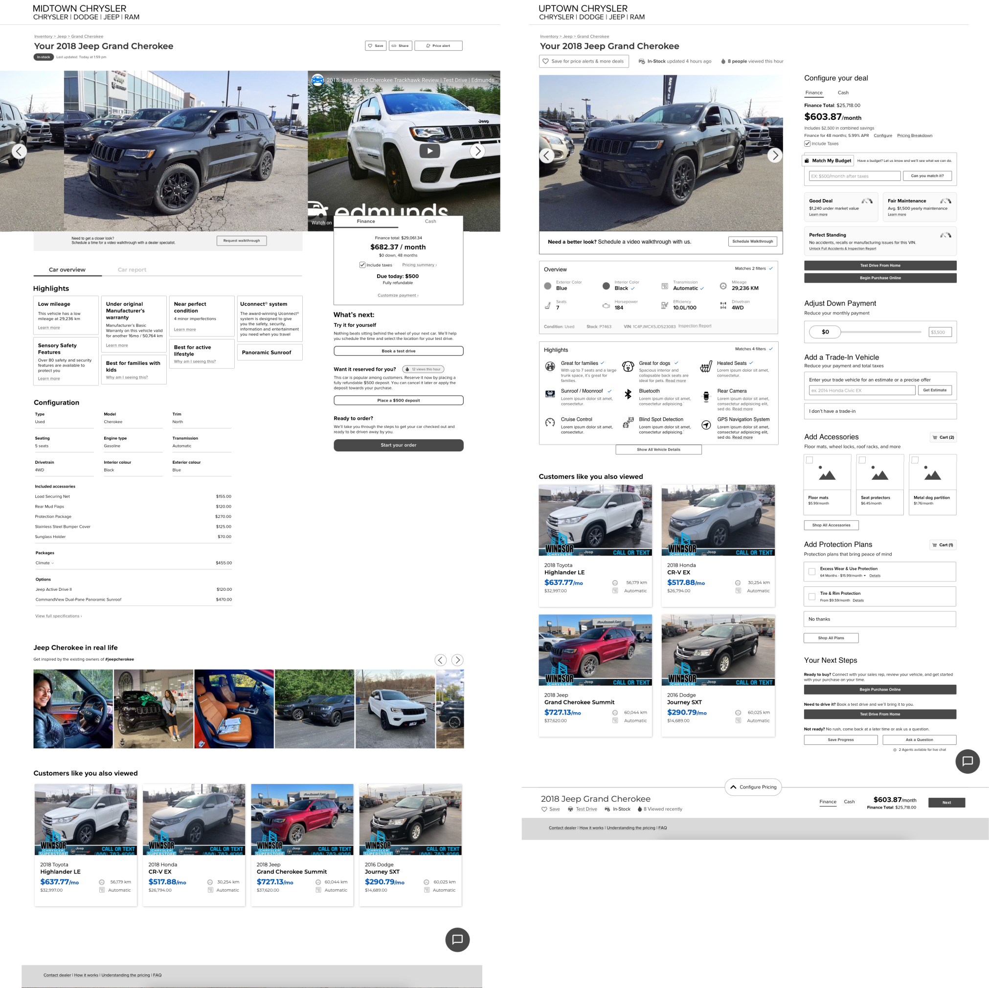
Our platform caters to not only research but also enables car buyers to create payment plans, add accessories, and fully customize their deals. During this initial round of wireframing, I aimed to clarify whether car buyers preferred solely researching or if they were interested in building their entire vehicle on the platform.
So, I came up with two concepts:
The first concept was designed to cater specifically to car buyers conducting vehicle research. Calls-to-action were strategically placed based on feedback received, with car buyers expressing their initial steps as "booking a test drive" or "placing a deposit" to secure the vehicle.
In contrast, the second concept provided car buyers with a seamless and comprehensive checkout experience, all on a single page. This allowed them the freedom to review all vehicle details and initiate their order by adding accessories, protection plans, and more. The concept further highlighted their exact price right away, streamlining the entire buying process.
I aimed to test our concepts against both our current page and each other. My goal was to ensure that testers experienced each page as realistically as possible, putting themselves in the shoes of actual car buyers and avoiding subjective preferences like "I like this page better because it looks nice." To achieve this, I created a scenario that prompted testers to use the page to answer mock internal thought questions and complete a task. Success would be determined by reviewing which page caused the least customer friction, facilitated easy question answering, and emerged as the preferred choice for future use.
You have unfortunately been in a collision and your insurance company has determined your vehicle is a right off. They have given you $20k for the value of your vehicle.
You have also learned that you are expecting a child, congratulations.
Your sedan was getting too small to go on camping trips and to national parks with your dog. Adding a child would be too uncomfortable for everyone. This is a great opportunity to find a vehicle that will be more enjoyable for your growing family.
You goal is to find and buy vehicle that fits your budget and lifestyle needs.
Unmoderated testing (usertesting.com)
Test planCurrent state Vs New option 1 (12 tests)
Current state Vs New option 2 (12 tests)
New option 1 vs New option 2 (12 tests)
Male 55%
Female 45%
Ages 18-25 -> 10, 26-35 -> 8, 36-45 -> 6, 46-55 -> 6, 56-65 - > 6
What I observed from the test was that car buyers had already conducted extensive market research beforehand, and they sought a page that could validate their findings and confirm if the vehicle matched their desired features and specifications. At this stage, buyers were not ready to configure their entire deal; instead, they were focused on arranging a test drive, as most were still deciding between 2-3 vehicles.
Testers preferred this version due to its transparent pricing and details, which instilled a sense of trustworthiness. With less clutter on the page, testers found it more user-friendly and easier to navigate. Lastly, the emphasis on a large interactive gallery was highly appreciated by testers, as it served as a close replacement to the experience of physically visiting a dealership.
Here are some highlights and insights I used to create the final designs: