Research
I initiated a comprehensive research initiative to gather insights from customer surveys, both for the site and app, to understand the specific requirements and demands of users. To validate these findings and gain a deeper understanding of the market, I conducted a thorough analysis of the competition, specifically in the banking and financial technology sectors. This market analysis revealed a clear trend towards data visualization, which was confirmed by our own customer feedback. The majority of users, who are not analytical experts, require an easy-to-understand graphical representation of their financial performance, rather than having to navigate complex data tables or historical reports. The aim was to provide an intuitive and informative financial dashboard to enable users to make informed decisions towards financial freedom.
Challenges
After analyzing the research for several days, I identified four main challenges for the project, which included: helping customers to comprehend the data behind their finances and suggesting ways to improve their financial situation without being too suggestive, dealing with a complicated product offering, making improvements without adjusting the back-end systems, and enabling customers to complete the flows in an acceptable amount of time on a device.
The work
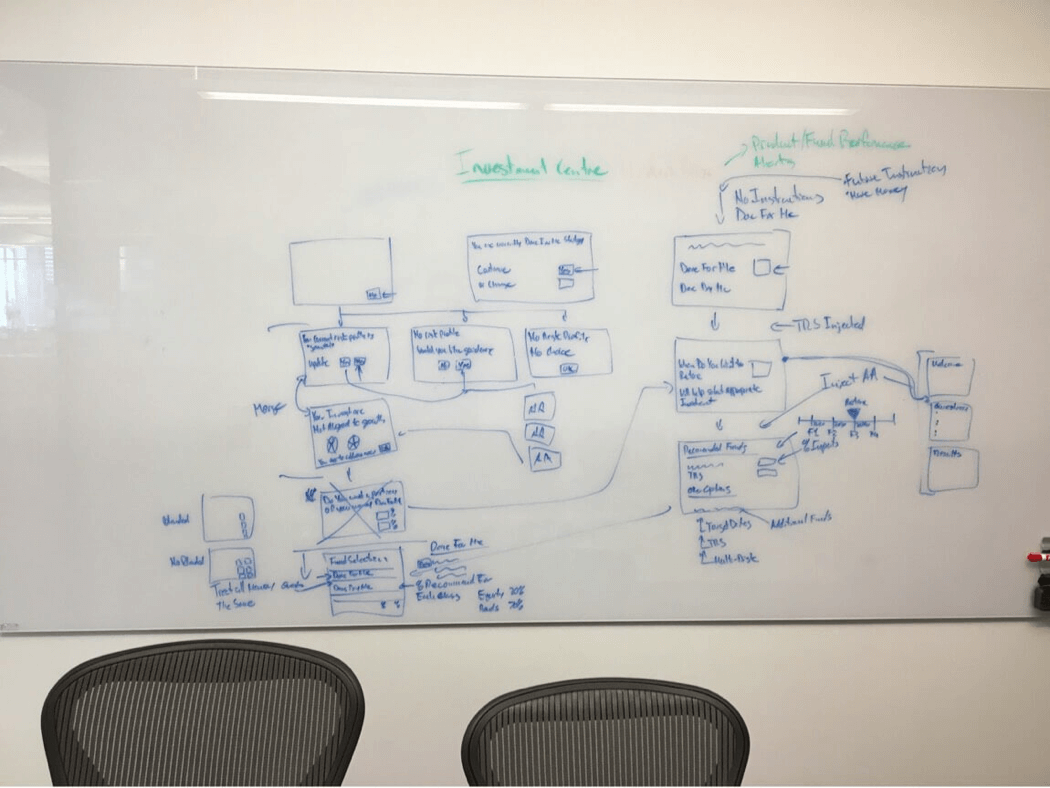
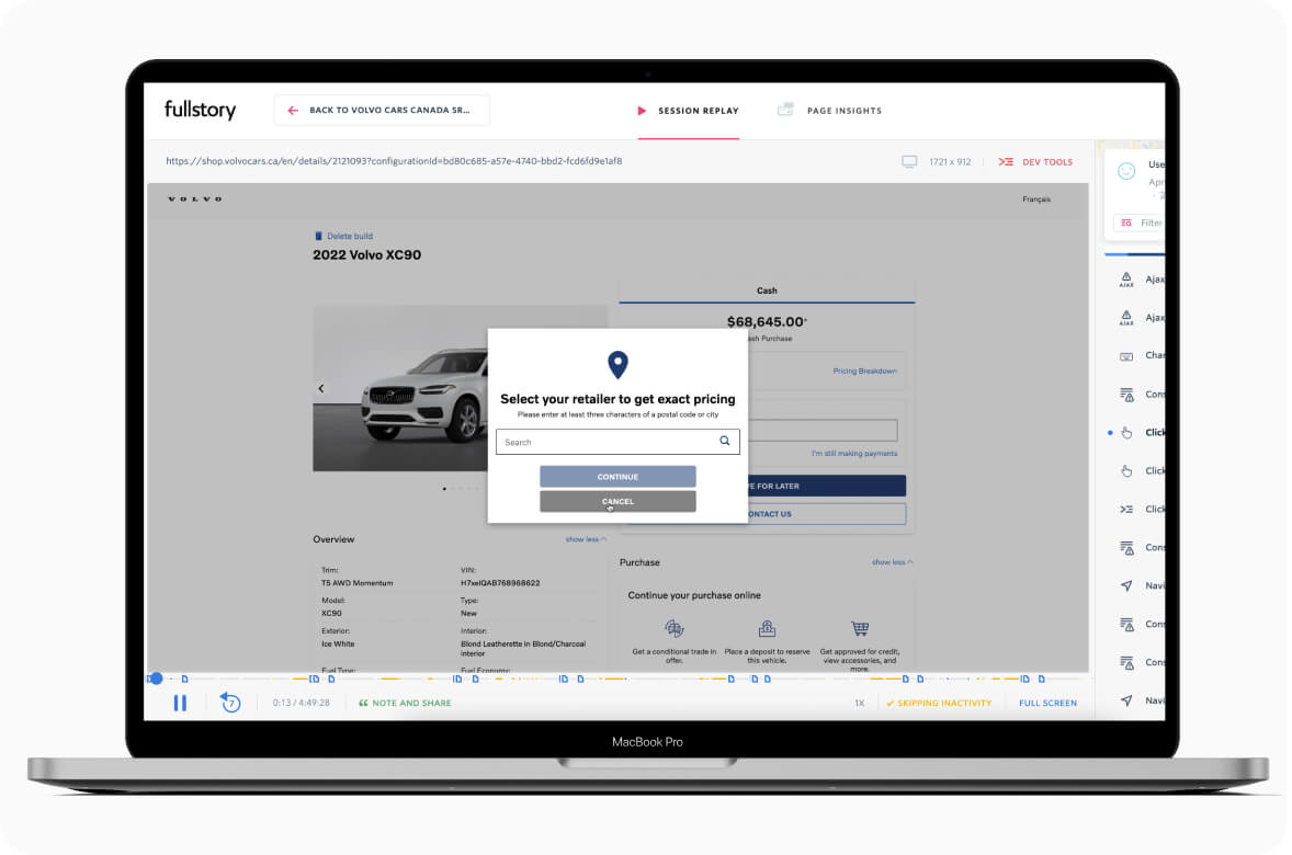
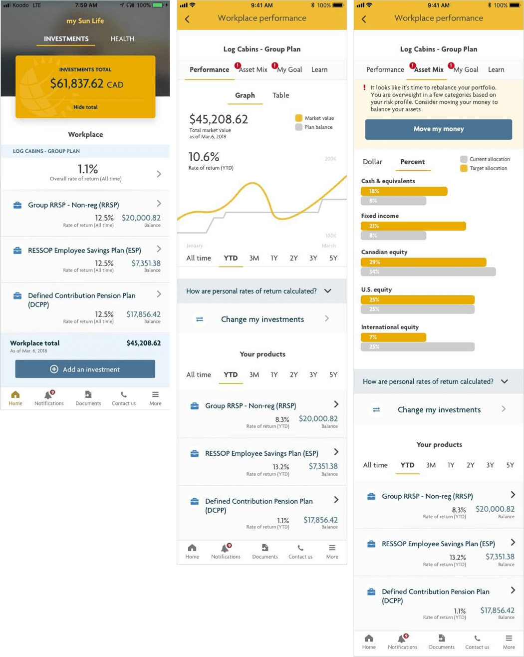
After identifying the main challenges, I shifted my focus to ideation and collaborated with the product owner to validate user journeys and discuss potential solutions. The critical task was to improve customers' understanding of their investment performance and whether they needed to make any changes to their plan. However, the app homepage only provided a high-level overview of the investment products and balance, which left customers frustrated and confused about their investments' performance. This frustration was further exacerbated by their previous experience with other bank apps where this information was readily available.
The solution
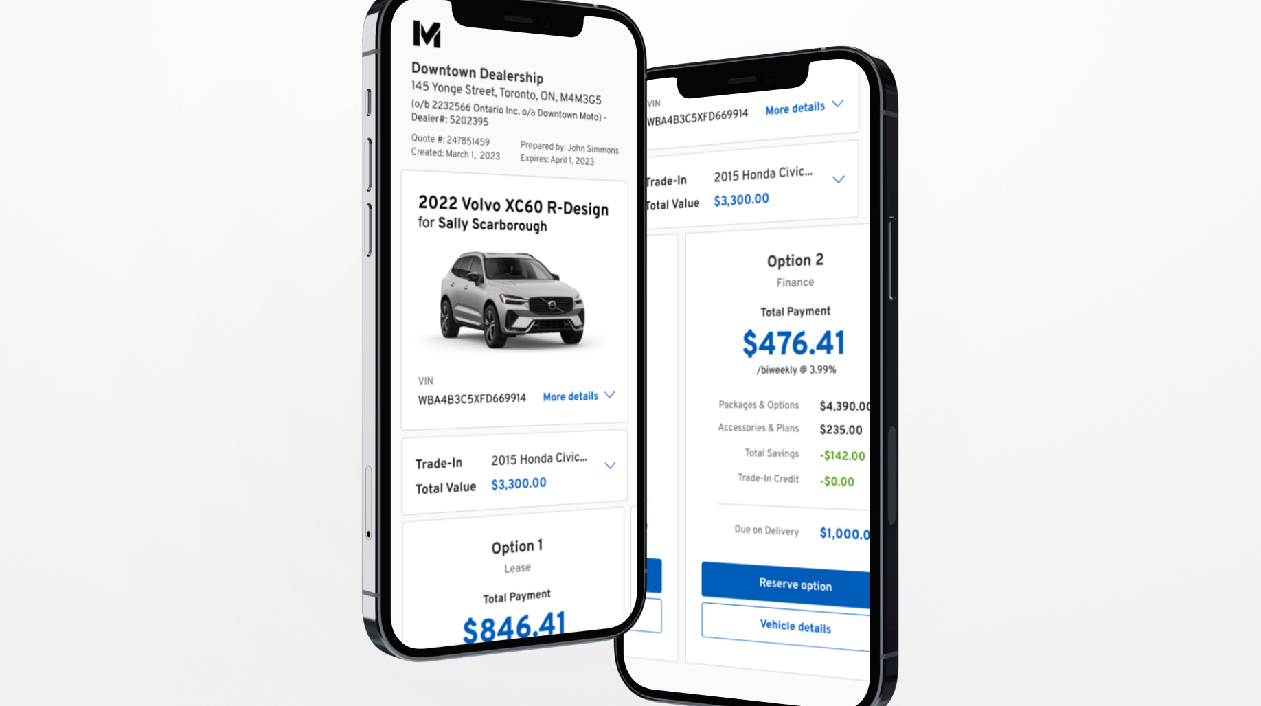
To improve the customers' understanding of their financial performance, I first created an "at a glance" view on the homepage, which allowed users to quickly comprehend their finances upon login, thus increasing their engagement with the app. To further enhance the customers' knowledge, I added a "plan level" performance indicator, enabling customers to see how each product and their portfolio was performing. To make the performance data easier to read and understand, I replaced the previous table format with simple graphs based on research findings. Additionally, to help customers understand their investment allocation, I designed a way to show their existing allocation vs. where it should be based on their tolerance for risk. For instance, if investments were over-allocated in one section, causing less-than-desirable results, the app would alert the customer and provide tips on how to improve.
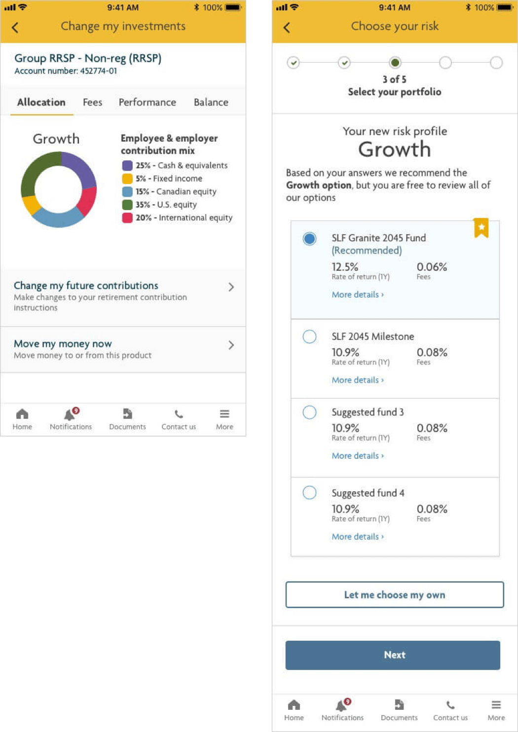
After addressing the challenge of understanding investment performance, my next task was to enable customers to make changes to their investments by selecting different funds. To achieve this, I incorporated a questionnaire that helped customers determine their investment goals and risk tolerance levels. Based on their responses, the app could then suggest a recommended fund and show other options with their related rate of return and fees, empowering customers to make informed investment decisions.
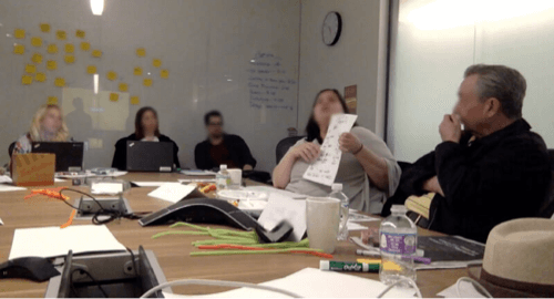
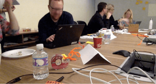
Testing
After gaining confidence in my solution internally, it was time to test my concepts with the market. As this was one of the most important projects of the year, I brought in a focus group to go through a prototype and provide feedback. My primary goal was to understand what the market wanted in a financial app. Building on my success in improving customers' understanding of investment performance, my next task was to enable them to make informed investment decisions by selecting different funds. To achieve this, I incorporated a questionnaire that helped customers determine their investment goals and risk tolerance levels. Based on their responses, the app could then suggest a recommended fund and show other options with their related rate of return and fees, empowering customers to make informed investment decisions.
Workshop Schedule
- Welcome
- Ice Breaker
- Getting to know the participants
- Group discussion: Positive & negative experiences with investing
- Prototype review
- Design session (participants designed their own solution and present to the room. We did dot voting after to decide on the winner)