How redesigning a location select screen increased user engagement for Volvo
How I improved the morale and environment of the UX team at Motoinsight by focusing on building trust, measuring progress, and fostering individual growth.
How I improved the morale and environment of the UX team at Motoinsight by focusing on building trust, measuring progress, and fostering individual growth.
As a leading automotive manufacturer, Volvo offers a wide range of vehicles to its customers. As part of the online buying process, customers have to select a dealership closest to them. However, there was a significant drop-off point when car buyers entered the vehicle details page and had to select the dealership closest to them. The reason for the drop-off was not immediately clear, as it was a simple location select window. I was tasked with investigating and addressing this issue to increase the conversion rate for Volvo.
Initially, I reviewed Google Analytics to see if I could find any insights into the drop-off. However, the answer was still not clear. I then opened our session recording tool to review car buyer’s behavior and understand the problem better. After watching a few dozen sessions, it became very obvious where the problem was. Car buyers were so used to ads popping up that they were very good at closing windows quickly. When the location select window started to load, car buyers were able to close it before the content even loaded. This then took users away from the page and put them back on the search results page. This left users confused, frustrated, and with no understanding of what happened or how to get back.
To address this issue, I redesigned the location select screen to be non-dismissable without first reading the content. I introduced a two-step confirmation process to help users understand the consequences of not selecting a retailer. This update immediately led to a dramatic decrease in bounce rates from 41% to 4.5%. Furthermore, there was an increase of 36,600 visits per month. The redesigned screen also served as an educational piece for car buyers, as they were now able to better understand how to return to the screen when they were ready to select a retailer.
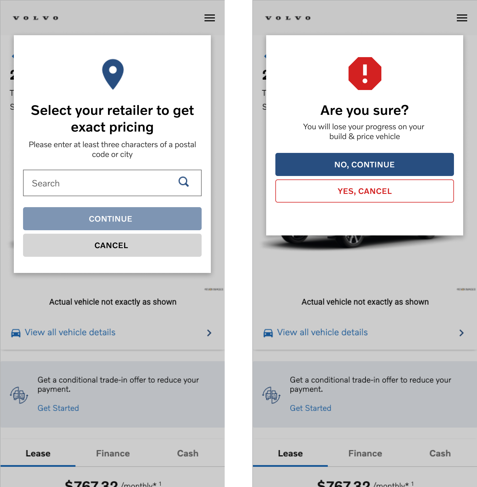
Overall, the redesign was a significant success, as it was only through behavioral analytics tools and understanding customer behavior that the issue was identified. The client was pleased with the results, and the lead conversion rate increased as a result. The redesigned location select screen improved usability and ensured that users could not accidentally dismiss it, leading to a better experience for Volvo's customers during the online buying process.